More bubble charts – your feedback please!
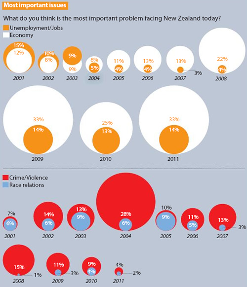
Last week’s Sunday Star Times featured inaccurate bubble charts and it has happened again this week:

Sunday Star Times, 12 February 2012, “Rugby joy short-lived” A2
You can see that diameters of the circles have been used to represent the percentages, rather than the area. This gives a distorted view of the situation as our eyes notice the area, rather than the diameter/height.
For example, look at the Crime/Violence and Race relations data for 2008 where you are comparing the 1% and 15%. Many more than 15 of those little 1% circles can fit inside the 15% circle.
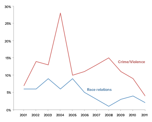
For comparison, here’s the Crime/Violence and Race relations data as line graphs:

One could be also drawn for the Unemployment/Jobs and Economy data (or overlaid together, depending on what you’d like people to easily compare).
What I’m really interested in are your thoughts on the following:
- Which graphic do you believe is more easily understood by the general public? Why?
- How important is it for the media to use accurate graphics versus getting across the general idea? I.e. does it really matter if the scale is correct or not? Why or why not?
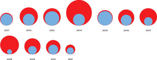
Update: Here’s the bubble chart where the areas represent the figures, rather than the diameters (click to enlarge). I have not included all the details in the graph, just wanted to show a size comparison here.
Hat tip: Murray Jorgensen

Of the two presented, the line graphs are obviously (imo) far superior, i.e they are at least accurate. It would be interesting to see how they stack up against bubble charts done properly, i.e. using area rather than radius.
It matters hugely, just becuase it’s visual, doesn’t mean that it is any less important to convey information accurately. Doing things like using the bubble charts incorrectly mean that they are conveying false information. Which is at best, pointless.
13 years ago
Thanks Ben – that’s a good point about having a corrected bubble chart as well. Have added that to my to-do list!
13 years ago
I prefer the line graphs as well. It not only show the differences between two options but also the changes in the history.
I found the bubble plots are very confusing. i was confused wether the circles (area/radius) represent the sample size or the percentages, then the percentages in the circiles, e.g., 23%, does this mean 23% of the circle area represents the people who selected the option?
Media just want to enlarge the concerns at some points. They think readers are bored with old style line graph, so they use something they think it is fanncy.
I personally don’t think the scale is a big deal. Because there is no significant tests here, the margin of errors are unknown. reader only recognise the differences by looking at the graphs (both plots above) but have no clue of the significance of differences.
13 years ago
I’m not sure that the media are bored with line charts and scatterplots. Puzzled and stressed by them might be closer to it. Perhaps this is why the media continually try to come up with alternatives to them. Statisticians and scientists see them so often that we can tend to assume that everyone knows how to interpret them. Maybe be this is something that the educational system falls down on. It’s not just in the sciences: history and geography teachers, for example, could be making appropriate use of these kinds of graphics.
13 years ago
The line graph is obviously better – not least because it’s accurate, which can’t be said for the bubbles. I’m all for pretty data, but pretty and wrong is no good to anyone.
It’s not clear exactly what The Herald are trying to tell us. If they are interested in how how one category compares with another over time they might have considered stacked bars – since we are generally better at perceiving differences in height than area.
13 years ago
I think the line chart works better for this data – presented that way, it’s a simple graphic that allows you to see both the progression of time and that there might be a relationship between the two datasets over the period shown.
The bubbles seem to get in the way of understanding that relationship over time. They confused me at first, I didn’t realise the time element was important and didn’t see how each pair of bubbles related to the next (although I expected there was a relationship due to the use of similar colours).
I think the scale (and the 0-point on the y-axis) should be included because otherwise we could be looking at very small differences or mis-represented rates of change.
13 years ago
1. The line graph is hands down easier to understand. 2. It should be very important for media to convey a good (and memorable) idea of the issue being covered, particularly if their mission is to inform.
I was thinking that, if one was really into using circles, one could use a series of pie charts (I know, most people reading this blog hate them, including me) to provide a sense of proportion.
As an aside, it is interesting that magazines that target decision makers (e.g. The Economist) use mostly line charts and bar charts in their articles.
13 years ago
Everyone seems to like the line graph, but there is probably a sampling problem. I doubt the Herald’s readers are that similar to statschat readers so the Herald might be trying, quite rationally, to find a way of presenting statistical information to readers who have a hate/fear of statistics. In that sense they should be applauded for the attempt. Just a pity they managed to screw it up.
13 years ago
Ben: I’ve been pondering on this too. If those who are more statistically literate find the bubble charts hard to make sense of and understand (and this is unrelated to the incorrect sizes), what about those who are not?
Has the end result been that it’s something pretty for people to look at but not learn anything?
13 years ago
Has the end result been that it’s something pretty for people to look at but not learn anything?
Yes. Grabbing readers’ attention dominates learning in this particular case. It reminds me of a newspaper front page I saw in South America some years ago, which featured a picture of a topless woman with small lettering covering her nipples. The small print message was ‘huge increase in price of bread’ (a staple food in many South American countries).
I guess not that many people read the small print…
13 years ago
[…] #learning – How NOT to draw bubble charts […]
13 years ago
[…] telle que celle présentée dans le "Sunday Star Times" du 12 février 2012 (reprise sur http://www.statschart.org.nz). Outre le fait qu'il existe des façons plus adaptées de représenter l'évolution de deux […]
10 years ago