Inequality graph
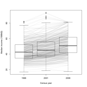
 I think this graph is an improvement over the density plot from StatsNZ I showed earlier. It’s a box plot of median income for all census meshblocks in the Auckland region, in 1996, 2001, and 2006 (except for the ones that were too small to have data released publically). The data are from Stats New Zealand, rescaled to 1996 dollars
It’s clear from this graph that most areas had an increase in median income, but that the increase was larger in wealthier areas. A few areas went up sharply, then down again, presumably in the dotcom crash. Some of the larger decreases are probably due to changes in housing mix: two meshblocks in Auckland Central have declined a lot, and I expect that’s due to more small apartments.
It’s also worth noting that the percentage increase in median income is much closer to being constant across meshblocks. In that sense the increase in inequality is not as bad as in the US, where increases in GDP have almost entirely ended up with the rich.
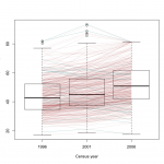
 [Update: here’s a version where the areas that decreased from 1996 to 2006 are in a different color. I don’t know if it helps for seeing the overall pattern. Given more time and if WordPress took SVG, it would be possible to have mouseover labels for the meshblocks so you could see which is which.]
Thomas Lumley (@tslumley) is Professor of Biostatistics at the University of Auckland. His research interests include semiparametric models, survey sampling, statistical computing, foundations of statistics, and whatever methodological problems his medical collaborators come up with. He also blogs at Biased and Inefficient See all posts by Thomas Lumley »
Do u think it will be better if we colour the line for, say, just the increase ones? Is it possible?
13 years ago