Who is really buying New Zealand? And it’s not what they plotted.
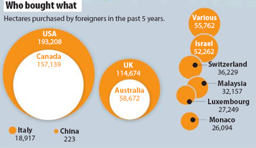
Today’s front page of the Sunday Star Times has a bubble chart showing the amount of hectares purchased by foreigners in the past 5 years:

Sunday Star Times, 5 February 2012, “Who is really buying New Zealand?” A1
While bubble charts are a trendy way to present data, it is well-known that people find it hard to judge areas and even more so when the circles are not concentric (their centres don’t coincide) or when the shapes overlap as in the Sunday Star Times’ chart.
However, there’s more problems with this graph. The bubble sizes just don’t match the data.
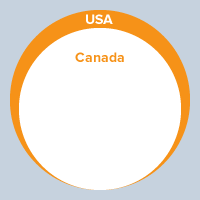
Compare USA with Canada – the area bought by Canadians was about 81% of the amount brought by Americans but the area in their chart is only about 58%.
It should have looked like this:

Compare China with Italy and you definitely know something has gone wrong in the calculations.
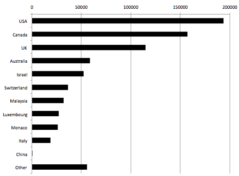
A better way to compare is via a bar chart: not quite as sexy looking but much easier to make comparisons:

Rachel Cunliffe is the co-director of CensusAtSchool and currently consults for the Department of Statistics. Her interests include statistical literacy, social media and blogging. See all posts by Rachel Cunliffe »
Great post, Rachel – I found the bubble graphs hard to read; a bar chart gives you the info in one glance. Do you have any tips about what sorts of graphic treatments work best with certain data?
13 years ago
That’s a great question Julie and I’ve been hunting for a good concise summary of graphs which is available online as there’s so many different types of data.
The big difference here between the bubble chart and the bar chart is the in the bubble chart, areas are used to represent the numbers. In the bar chart, lengths are used to represent the numbers. When you’re trying to compare numbers like this, it’s easier to compare lengths than areas with your eye.
13 years ago
Bar charts work well when there isn’t important uncertainty in the numbers, the numbers aren’t negative, and zero is a sensible part of the range of values.
In this case all three are satisfied, but bar charts are also used for a lot of lab data where the uncertainty is important and a dot with confidence intervals would be more useful.
Bubble plots can make sense when you need to show the location in two dimensions in addition to the value (which isn’t the case here), but the viewer’s perception of the numerical values will be somewhat imprecise. They are also useful when there isn’t room in one dimension to show nesting, though I prefer the XKCD approach
Examples: nesting, cartogram, bubble map
13 years ago
It would be interesting to compare the different coverage of foreign purchases in New Zealand versus New Zealand purchases overseas. Why doesn’t anybody complain, for example, about Kiwis buying overseas farms? Let’s start having a look the other way around: Fonterra first.
Concerning the graphs, it could be the typical use of radius rather than circle area screw up.
13 years ago
Re: radius vs area – I wondered that too Luis; and it certainly is the case for USA vs Canada – but it doesn’t account for the other errors – e.g. Italy vs China.
13 years ago
Luis,
If you assume that foreign ownership is good for the foreigner and bad for the locals, they’re being perfectly consistent — they care about NZ, not about Argentina. And I think that’s what a lot of people do believe.
13 years ago
If the zero sum game were true there would be no foreign investment, because no country would want to ‘lose’. A related issue is the buy local story (Buy Kiwi and we’ve got it made). If other countries followed the same philosophy we would be screwed, as we are a country that relies on exports. Of course you know that.
13 years ago
Of course. But simple mercantilism is less obviously wrong when it comes to land sales. It still /is/ wrong, but it’s less obvious.
One thing that may be useful is to point out that land, in contrast to almost anything else that foreigners might buy, can’t be shipped back overseas.
13 years ago
And the data is incomplete. Germany is mentioned in the text but doesn’t show up in the charts.
13 years ago
If you knock off five zeroes, you get approximately %ages, so US investors own just under 2% of NZ agricultural land.
13 years ago
Interesting post. Crafar farms has the attention at the moment partly because of size. The farms have a combined area of about 7900ha, according to the Stuff website. This sale is not included in those charts, as it doesn’t fall into that period.
There seem to some great info-graphics around these days, on overseas websites.
13 years ago
What are some of your favourite infographics lately Chris? I love the work at the NY Times.
13 years ago
There is a similar bubble-chart on page 2 of today’s (12.2.12) Sunday Star Times, and the proportions are even more flagrantly distorted!
13 years ago
Thanks Murray, I just got back from a weekend away so am off to get a copy!
13 years ago
Surprised at how much effort goes in to info graphics overseas. I don’t think we have specialists on the staff of NZ media, do we?
Quite like this one, for the points it makes, not so much for presentation wizardry.
http://mashable.com/2012/01/29/sopa-and-hollywood/
13 years ago