MV Rena oil graphic
Articles about the MV Rena appeared in the New Zealand Herald over the past week and I’m surprised they didn’t show up in the Stat of the Week competition.
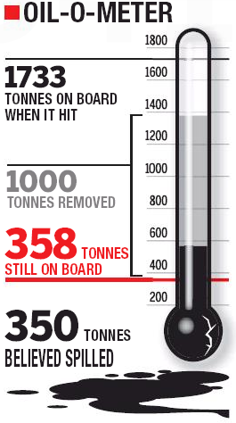
Let’s take a look at one in particular, from October 31. See that graphic there? Cam Slater didn’t like the manipulated Likert-scale, but I was more concerned by the thermometer:
It raises more questions than it answers, and even after several minutes staring at it and trying to decipher it, I was even more bewildered. The areas are overlapping, there’s a giant bulb on the bottom hiding where 0 belongs, and the different colours and sizes drag the eye around in a mad series of saccades.
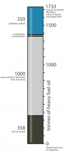
I took it upon myself to redo this into something a bit tidier and less confusing. Is it better? I’ll let you be the judge of that:
Stephen Cope is more than a little cautious about believing studies that defy belief. He wants to see the numbers first. See all posts by Stephen Cope »


Much better! I just find the faux reflection a bit distracting. Question: the ‘uncertainty on estimation’ corresponds to the total oil, the spilled or something else?
13 years ago
Uncertainty comes from the leftovers after each value was plotted, and it popped out as obvious on my graph but wasn’t seen on the original.
1733 (starting)
-1000 (Awanuia)
– 358 (onboard)
– 350 (spilled)
= 25 tonnes
The ship’s manifest, meters on the Awanuia, and volumes of the tanks on the ship are all known, which leads me to think it belongs in the spilled category.
13 years ago
I’d order the sections differently: we have oil that has already spilled (350t), oil that is still on board and may spill in the future (358t), and oil that has been removed and won’t spill (1000t), and I’d plot them in that order.
13 years ago
I was rethinking this graph this morning and also came to the conclusion that oil spilt and oil that could potentially spill should be adjacent.
However, I would leave the remaining oil at the bottom, mimicking the way the remaining oil is still in the lower parts of the ship. It would provide a more natural view, especially if more of these graphs were laid out to show daily progress in pumping.
13 years ago
Is there a source for daily data on this? Would also be interesting to see a line graph of the oil left on the Rena over time, along with another line graph of the oil split from the Rena over time.
13 years ago
I was going to extract the graphs from the NZ Herald and reformat them. Otherwise my source of data would be from MaritimeNZ:
http://www.maritimenz.govt.nz/Incident/timeline.asp
13 years ago