October 3, 2011
Stat of the Week Winner: September 24-30 2011
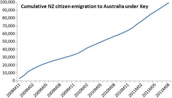
This week we’ve chosen Jeremy Greenbrook-Held’s nomination of this graph found on political blog The Standard:
Many have been criticising the graph, including David Farrar, those in the comments on The Standard and a blog post on Stuff, and here’s a summary of the main concerns:
- Using cumulative figures, making it appear as though the rate of emigration is increasing.
- Starting the graph at zero makes it appear as though no-one emigrated prior to John Key becoming Prime Minister.
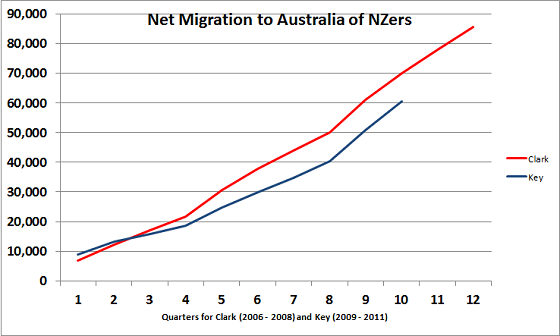
- The graph uses gross migration rather than net migration
- Not displaying historial emigration data for comparison
David Farrar created a graph which addresses points 3 and 4 above:


[…] John Pagani (inaugural winner of the University of Auckland’s bad stat contest, recycler of a graph that won the same competition another week, and something of a low-hanging fruit when one feels the […]
14 years ago