Emigration graphics
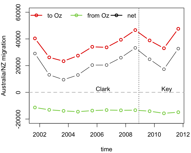
The big problem with our stat-of-the-week was the graphics. While David Farrar’s redesign to add the early years of Helen Clark’s government provides some context, a cumulative graph is not a good way to see changes over time. For anyone who actually wants to see the immigration/emigration rates over time, rather than just making a political point, here is a non-cumulative graph using data I downloaded from Stats New Zealand. The dots are totals for the 12 months ending August each year (the most up-to-date values available).
Disaggregating immigration and emigration is helpful here: immigration from Australia has been roughly constant, but emigration to Australia fluctuates a lot, on top of a weak upwards trend.
Thomas Lumley (@tslumley) is Professor of Biostatistics at the University of Auckland. His research interests include semiparametric models, survey sampling, statistical computing, foundations of statistics, and whatever methodological problems his medical collaborators come up with. He also blogs at Biased and Inefficient See all posts by Thomas Lumley »

But you are making an entirely different point.
The issue arises because of the promise that we would not any longer, under Key, be ‘waving goodbye to loved ones.’
http://www.kiwiblog.co.nz/wp-content/uploads/2008/09/natbillboard1.jpg
The entire question to ask, therefore, is ‘how many loved ones have we waved goodbye to?’
This in no way has anything to do with Clark, and it is misdirection to compare emigration today with emigration during Clark’s time in office. One might as well compare emigration under Key with emigration from the Sahara.
What we need to know is ‘by how much has this promise been broken since Key took office?’
The starting point for that promise is therefore necessarily zero, and it turns out that this promise is broken by more each day.
You seem to think cumulative increases are inevitable. But that assumption precludes the possibility that the National Party promise could have been kept at all.
The cumulative graph therefore simply tests the promise that was made.
To the extent it is an undesirable format, that is simply a reflection on the credibility of the promise that was made.
You have tried to fix that problem by inventing a wholly different *comparative* problem to solve.
14 years ago
Yes, if you think total (not net) emigration should have instantly fallen to zero after the election and just want to show that it didn’t, the graph is more or less reasonable.
I can’t imagine many people thinking that was a the relevant comparison, but I suppose you might be right.
I still think the non-cumulative graph would show that more clearly if it had happened — it does show that Key’s government has had essentially no impact on emigration. I don’t think this is surprising, and I don’t see that there’s much that a PM can do about it in the short term, but, as you say, he did promise to.
By the way, it would be nice if someone could point us to some misleading or badly-designed right-wing statistics and graphics from time to time. They must be out there, but I don’t come across them very often.
14 years ago