September 30, 2011
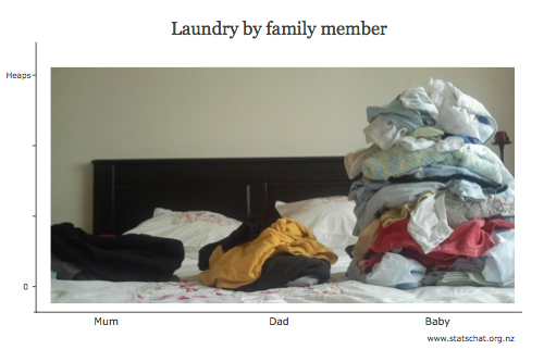
Infographic: Laundry by family member
Data visualisation is difficult to do correctly, but this one just sort of fell out while I was sorting the family’s laundry:
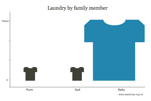
This sort of graphical representation is easy to do improperly, the most common offence being to scale on more than one axis, causing the area to confusingly increase at a much greater rate than the underlying data:
Here I demonstrate just one of many ways in which the graph can be manipulated to mislead the eye and thus the viewer.
Edward Tufte would still dislike my original graphic: there’s too much “chart junk” in the background. Move that pillow!
Stephen Cope is more than a little cautious about believing studies that defy belief. He wants to see the numbers first. See all posts by Stephen Cope »


Such truth in that graphic! Thanks Stephen :)
14 years ago
Love it
14 years ago