Posts from June 2011 (17)

June 17, 2011

Brad Pitt uses statistics

Almost three months before it’s due to hit theaters, Sony Pictures has finally released a full-length trailer for Moneyball, an adaptation of Michael Lewis’ 2003 bestseller that chronicled how the Oakland Atheltics used data analysis and advanced calculations to field a winning baseball team on the cheap.

Read more

Reporting of health risks in the media

New research published in the journal Public Understanding of Science from a group of British researchers including Ben Goldacre of Bad Science has found that misreporting of dietary advice by UK newspapers is widespread and may contribute to public misconceptions about food and health.

The authors took the Top 10 bestselling UK newspapers for a week and evaluated the evidence for every single health claim reported on using the best currently available published research. Each claim was graded using two standard systems for categorising the strength of evidence.

They found 111 health claims were made in those UK newspapers over one week and in only 15% of those claims the evidence was “convincing”.

For more details and limitations on the study, see this Guardian article by Ben Goldacre in which he concludes:

It seems that the majority of health claims made, in a large representative sample of UK national newspapers, are supported only by the weakest possible forms of evidence.

People who work in public health bend over backwards to disseminate evidence-based information to the public. I wonder if they should also focus on documenting and addressing the harm done by journalists.

June 15, 2011

What happens when statistical accuracy is sacrificed for speed – a cautionary tale

Nielsen’s CMI parade rained on as ‘unprecedented’ fieldwork issues affect print readership data

From Stop Press:

The stock imagery on the release might show people laughing with magazines, but there probably aren’t too many smiles in the print industry after several unexpected fieldwork issues affected the quality of readership data for Nielsen’s newly pimped out Consumer and Media Insights readership survey.

Nielsen’s managing director Stuart Jamieson couldn’t be reached for comment, but the main issues impacting on the Q1 2011 survey, according to a letter sent to publishers and agencies, were the suspension of fieldwork in Christchurch and surrounding areas following the earthquake that resulted in a shortfall of interviews, best practice methods not being followed by all interviewers that led to an exclusion of some data and staff shortages in Auckland.

“Nielsen and the survey auditor, Professor Peter Danaher believe that the unprecedented effect of these fieldwork issues has had a negative impact on readership results for the quarter,” Jamieson said in the letter. “Not all issues with Q1 fieldwork can be resolved immediately. The survey auditor has requested that missing interviews in both Christchurch and other Regions must be replaced. We will be working with the Auditor with a managed programme to replace surveys over the remaining survey periods of 2011.”

After the Print Media Industry Research Review Group signed up Nielsen as its preferred research partner after a big pitch, the new survey was released with great fanfare a few months back and offered plenty of promise for the print sector. Fusing Statistics New Zealand’s Household Expenditure data to the survey meant publishers would be able to approach advertisers with, for example, specific data about how much readers or demographic groups spent in certain categories. It’s very valuable and helpful information, and while this data is thought to be robust and unaffected by the fieldwork issues, it’s disappointing for all concerned that its accuracy may be called into question.

Some might wonder why this data would even be released when doubts will inevitably surface about its accuracy. But, given the excitement over the new fusion, it needed to get that important piece of information out to the market and releasing the weighted data was seen as a slightly better option than not releasing any data at all; the lesser of two evils.

The usual flurry of press releases from the magazine publishers trumpeting their various gains hasn’t been forthcoming this year, due to a self-imposed moratorium on self-congratulation because of the fieldwork issues. But the biggest winners when comparing Q1 2010 with Q1 2011 are, once again, niche, special interest magazine titles, although some of the mainstream titles recorded what Nielsen refers to as ‘statistically significant readership gains’.

Continue reading at Stop Press…
June 14, 2011

Visualising migration

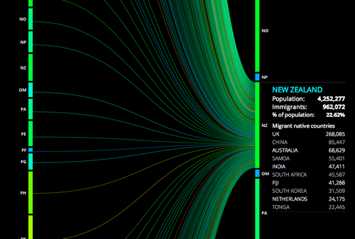
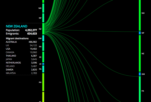
Peoplemovin displays world migration by listing emigration countries on the left and destination countries on the right. Line thickness represents the amount of people moving between the countries.

There’s some fascinating flows between countries to explore.

June 13, 2011

Mythbusters

Every time I watch a Mythbusters experiment I wonder about replication. They (almost) never replicate any of their experiments under the same conditions, or if they do, they do not tell the viewer how many times. It certainly would be nice to have some of the data from their experiments.

Here’s a link to a physics teacher who is thinking some of the same things.

http://quantumprogress.wordpress.com/2011/05/24/an-open-letter-to-mythbusters-on-how-to-transform-science-education/

June 10, 2011

If you haven’t seen it yet…

Google, on businesses and statistics

Google has started publishing a quarterly magazine, Think Quarterly, for some of its UK partners and advertisers.  The first issue is on data and statistics, with articles from Hans Rosling, of GapMinder fame, Google experts such as Hal Varian, their Chief Economist, and outside business experts like the CEO of Vodafone UK, and links to data visualisations around the web.