June 14, 2011
Visualising migration
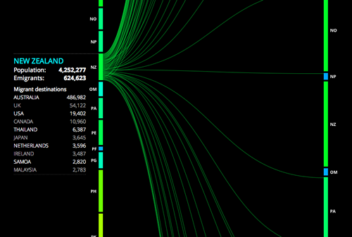
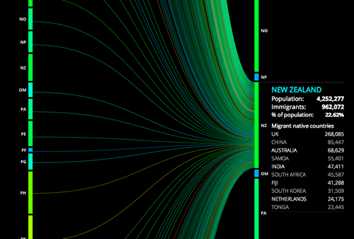
Peoplemovin displays world migration by listing emigration countries on the left and destination countries on the right. Line thickness represents the amount of people moving between the countries.
There’s some fascinating flows between countries to explore.
Rachel Cunliffe is the co-director of CensusAtSchool and currently consults for the Department of Statistics. Her interests include statistical literacy, social media and blogging. See all posts by Rachel Cunliffe »


Thanks – this is a wonderful site.
Would be great to see people, especially schools starting with a concrete approach to data visualisation like ‘the rice game’ http://www.stanscafe.co.uk/ofallthepeople/
Another great data visualisation talk is TEDTalk David McCandless The beauty of data visualization:
14 years ago