Posts from June 2011 (17)

June 29, 2011

Even toddlers use statistics!
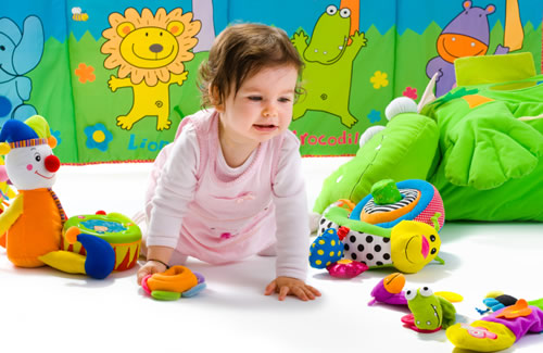
New research published in the journal Science from researchers at MIT has shown that toddlers as young as 16 months old are able to make accurate judgments about whether a toy failed to operate due to their own mistake or due to circumstances beyond their control.

The results give insight into how toddlers use prior knowledge with some statistical data to make accurate inferences about the cause of a failed action. These findings are contrary to commonly held educational assumptions that young children aren’t able to distinguish among causes and has implications for early childhood education and for how humans learn in general.

“Infants who saw evidence suggesting the failure was due to their own action tried to hand the toy to their parents for help. Conversely, babies who saw evidence suggesting that the toy was broken were more likely to reach for a new toy, as another one was always nearby.

“That’s the amazing thing about what the babies are doing,” said Schulz. “They can use very, very sparse evidence because they have these rich prior beliefs and they can use that to make quite sophisticated, quite accurate inferences about the world.”

“It was fascinating to see that they are even sensitive to this problem of figuring out whether it’s them or the world to begin with,” added Gweon, “and that they can track such subtle statistical dependence between agents, objects and event outcomes to make rational inferences.”
Read more about the study »

June 28, 2011

Interesting read

Here is an interesting blog post on the heated debate about the link between soda consumption and obesity in the US.

June 22, 2011

The Joy of Stats – BBC Four – 200 Countries, 200 Years, 4 Minutes – Hans Rosling

I enjoyed this Hans Rosling clip from YouTube:

Hans Rosling’s famous lectures combine enormous quantities of public data with a sport’s commentator’s style to reveal the story of the world’s past, present and future development. Now he explores stats in a way he has never done before – using augmented reality animation. In this spectacular section of ‘The Joy of Stats’ he tells the story of the world in 200 countries over 200 years using 120,000 numbers – in just four minutes. Plotting life expectancy against income for every country since 1810, Hans shows how the world we live in is radically different from the world most of us imagine.

More about this programme: http://www.bbc.co.uk/programmes/b00wgq0l

June 21, 2011

CensusAtSchool makes news headlines today

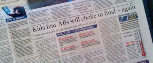
CensusAtSchool – one of the The University of Auckland’s Department of Statistics’ educational projects in association with Statistics New Zealand and the Ministry of Education – has made news headlines today with its survey findings on students’ thoughts on who will win the Rugby World Cup.

Read the original press release and the article on NZ Herald.

See also:

How trustworthy is Reader’s Digest’s “most trusted” list?

Yesterday Reader’s Digest released its annual list of most trusted people in New Zealand and the list got many people talking because of its surprising results: “Scientists topple sportspeople in ‘most trusted’” said the NZ Herald headline.

Today the NZ Herald followed up with a story on whether the survey itself could be deemed trustworthy. Professor David Scott from our department was ask to comment on the methodology and the not-so-obvious change in methodology compared with previous years and how that could influence the results.

The Reader’s Digest also puts out other “most trusted” lists and a complaint about the methodology was taken to the Press Council in 2004 by Variety Club but it was not upheld. The ruling points out that these polls are more about “which was more popular than statistically scientific”.

June 20, 2011

The Big Risk Test – BBC Lab UK

What sort of risk taker are you and why do you take the risks you do? You can find out more by participating in what aims to be the biggest ever study of the science of risk.

The Big Risk Test, developed by academics at the University of Cambridge, aims to be the biggest study of risk ever undertaken. Professor David Spiegelhalter and Dr Mike Aitken explain what the test is about and what they hope it will reveal here.

Take the test here.

Visualising quality of life in New Zealand

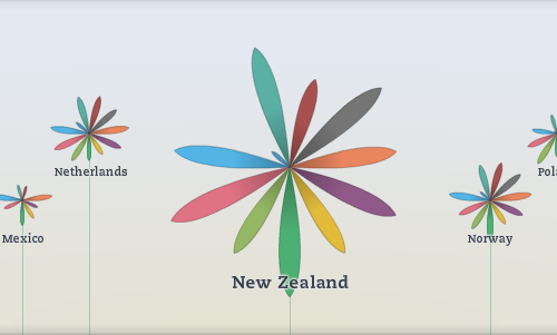
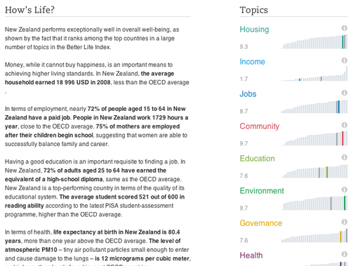
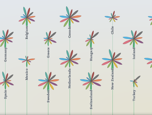
On May 24, the OECD launched a fascinating new interactive visual tool which allows you to compare quality of life: Better life Index. Rather than just focussing on GDP and economic statistics, this index allows you to compare lives across 34 countries, based on 11 topics: housing, income, jobs, community, education, environment, governance, health, life satisfaction, safety and work-life balance.

One of the unique features of the tool is that you can define what “better life” means for you by giving your own personal weight to the importance of each of these topics and find out how countries stack up. You can then share it with others by email, Facebook or Twitter and see which country best meets your criteria.

The data is presented in a beautiful and original format: by using flowers for each country, with a petal for each topic. The length of the petal represents the country’s score for that topic and the width represents the importance you’ve assigned to that topic. Each topic is based on multiple variables and the definitions are clearly explained, along with the ability to download all the data for yourself into Excel.

So, what does quality of life look like for New Zealand?

Overall, our flower looks quite healthy but what is that tiny little petal there? Go explore!

You can compare New Zealand to Australia (or any of the other OECD countries), and find out if New Zealand has the best quality of life you’re looking for!

June 19, 2011

Thanks Media Watch… and welcome!

Thanks Media Watch for the mention this morning for Stats Chat!  You can listen to the my interview online and if you’ve just discovered our newly-launched blog, welcome!

This is a group blog from various members of the The University of Auckland’s Department of Statistics.

We’ll be covering all sorts of topics of interest to the general public (so you don’t have to be a statistics major to understand everything here) – the use and misuse of statistics in the media (especially those relating to New Zealand), curated links to sites showing new ways of exploring data and more.

The misuse of DNA statistics

From the NZ Herald:

CIA personnel there compared it “with a comprehensive DNA profile derived from DNA collected from multiple members of bin Laden’s family,” the statement said. “The possibility of a mistaken identification is approximately one in 11.8 quadrillion.”

This is a common misreporting of DNA statistics and it highlights the confusion regarding evidence interpretation. The figure, 1 in 11.8 quadrillion, quoted in the CIA statement is known as a random match probability. It answers a specific question. In this case the question is, “What is the probability someone else has this profile, given what we know about the alleged victim’s (bin Laden) DNA profile, and the profiles of his extended family?” Note that this is a very different question from what is the probability that this DNA comes from someone other than Mr bin Laden?”

This is a very common mistake, so common in fact that it has a name, the Prosecutor’s fallacy. The fallacy usually relates to a misunderstanding regarding conditional probability.

In this case it is far more likely that the DNA analyst calculated a likelihood ratio. The likelihood ratio compares the probability of the evidence under two competing hypotheses. In this case sensible hypotheses might be, Hp: the body is Mr bin Laden and Hd: the body is someone unrelated to Mr bin Laden. The correct statement would be “The (DNA) evidence is 11.8 quadrillion times more likely if the body is Mr Bin Laden rather than if the body belongs to someone other who is unrelated to Mr bin Laden.” This is a statement about the evidence not about the hypotheses.

It is possible to give a statement regarding the hypotheses, but in order to do this we have to have some prior probabilities associated with them before we consider the evidence. The statistical formula that allows us to reverse the probability statements is known as Bayes’ Theorem.

Do I think the body belongs to someone other than Mr bin Laden? No, but I do think there is an obligation to use statistics correctly.

June 17, 2011

“Shocking world of our student drunks” – Where did that come from?

“Shocking world of our student drunks” shouted the 10 June front page headline from the New Zealand Herald.

“Nearly a third of university drinkers have passed out while boozing in the past six months”, it continued. Moreover, “27 percent of men and 9 percent of women say throwing up will not stop their boozing.”

And where did all that come from?

The figures came from a survey of students at just three student dormitories at a single university, and could therefore be symptomatic of a very localised culture, but were presented as picture of student behaviour across an entire country.

The authors of the source paper in the New Zealand Medical Journal carefully reported that their research population was “three student residential facilities in 2006”. In addition to their place of residence these students were very unrepresentative of the student body as a whole in terms of age and sex.

Most percentages quoted were related only to drinkers but sound in the news report as if they were percentages of all students.

Also 40% of those contacted did not take part. Ignoring nonresponse biases the male figures have an unacknowledged margin of error of the order of 7%.

So what is our point?

An implied applicability of the results that goes far beyond what is justified from the research undertaken and oversensationalising to make an attention grabbing story.